Big Bang Meca-10
Black Magic 45mm
An incisive editorial imagery to showcase the new Meca-10 produced by the Swiss company Hublot.
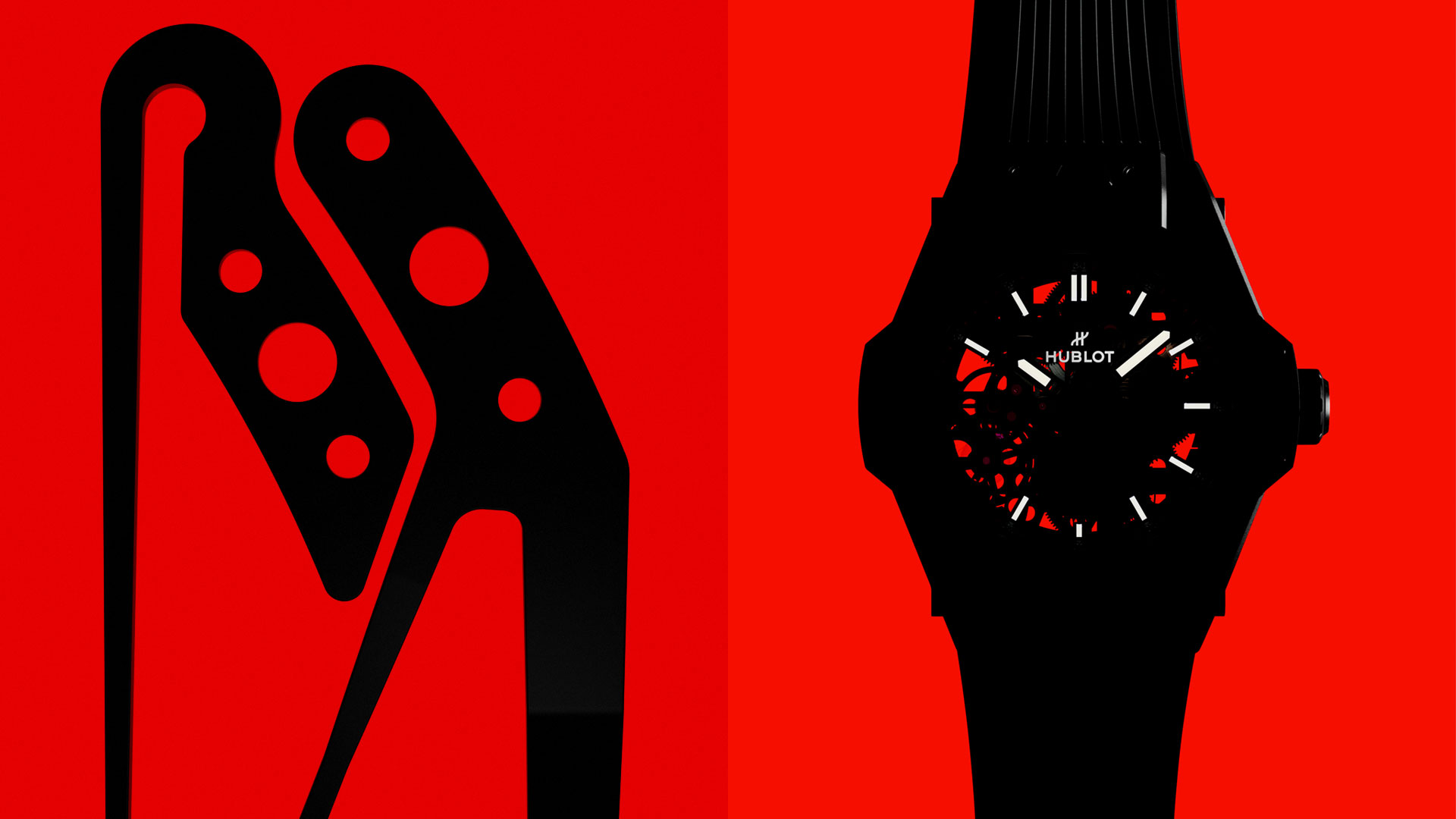
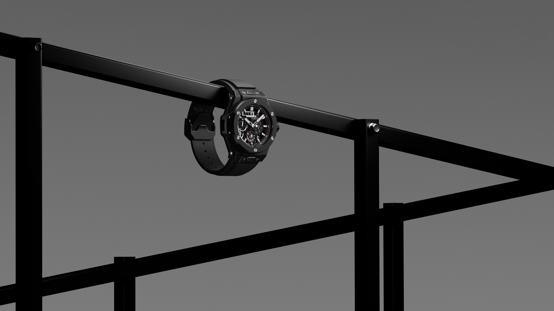
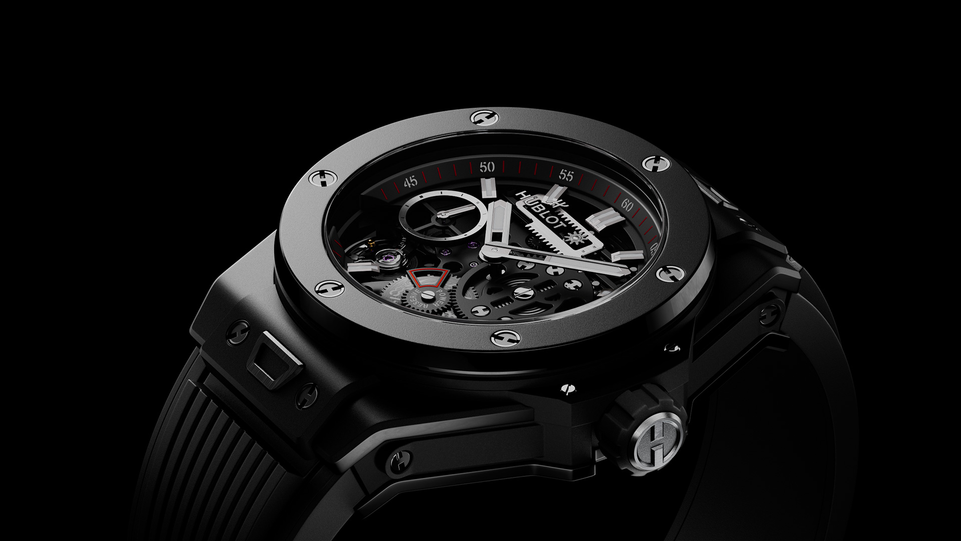
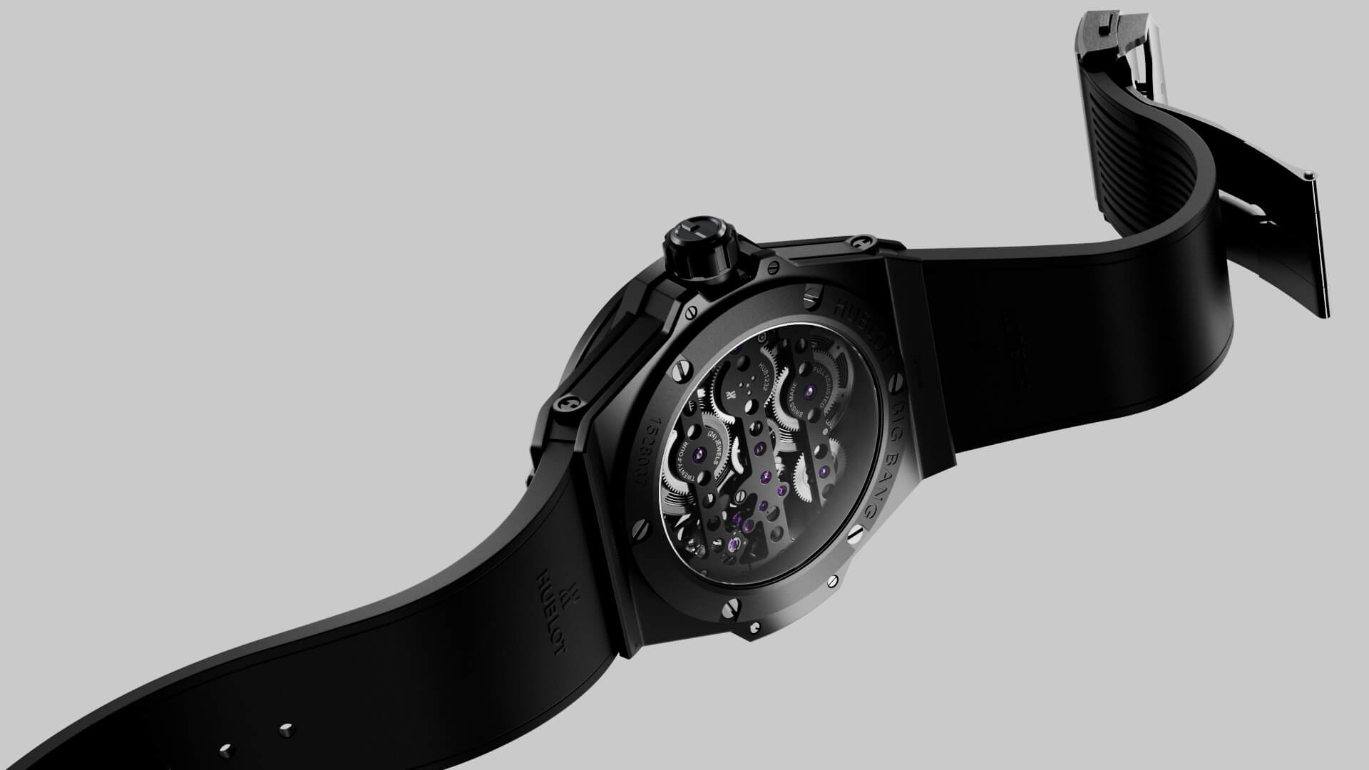
Razor-sharp reflections, contrasty silhouettes, and a strong limited color palette are just a few elements defining a fresh minimalistic language to highlight the ultimate Big Bang Meca-10 Black Magic 45mm by Hublot.
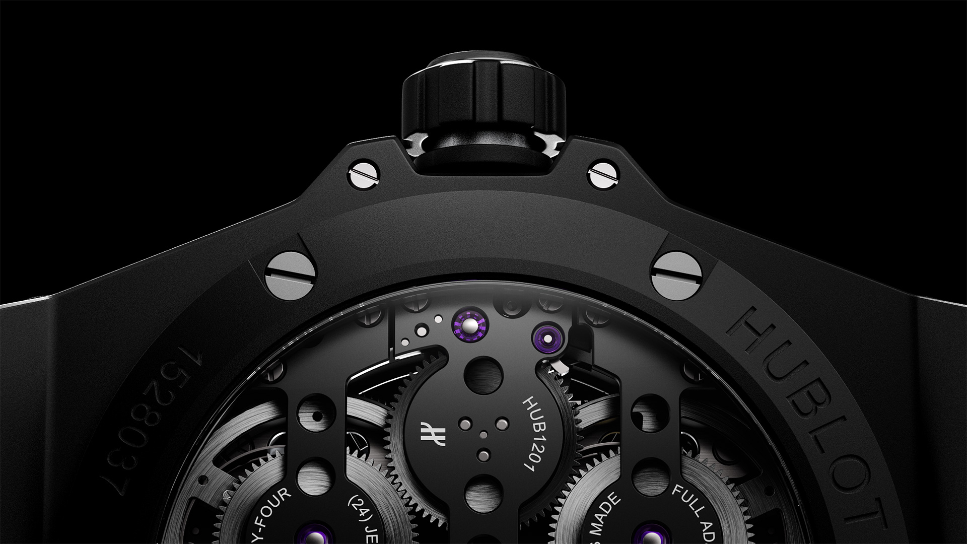
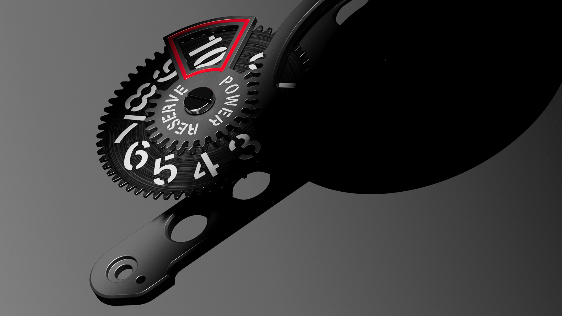
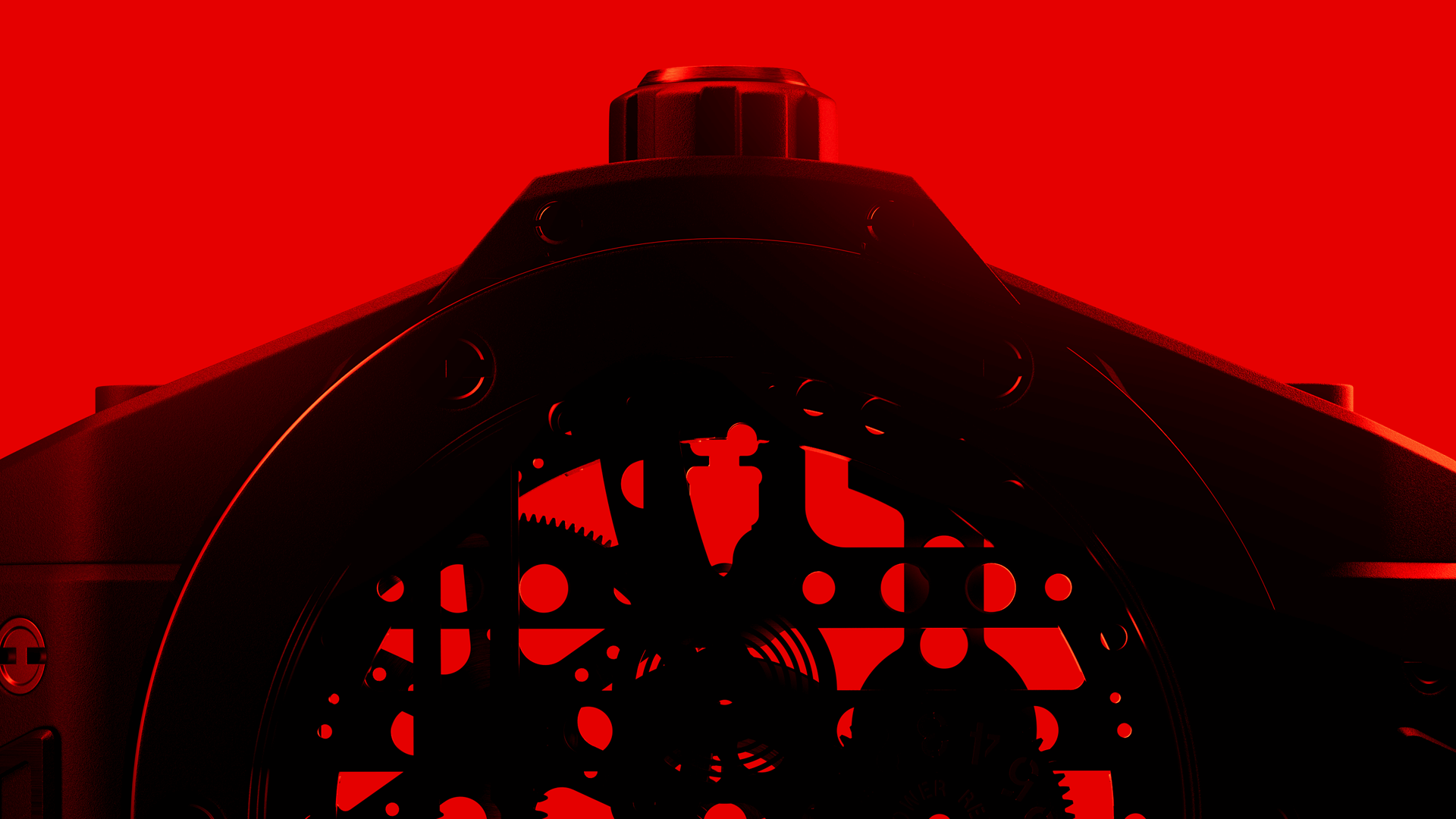
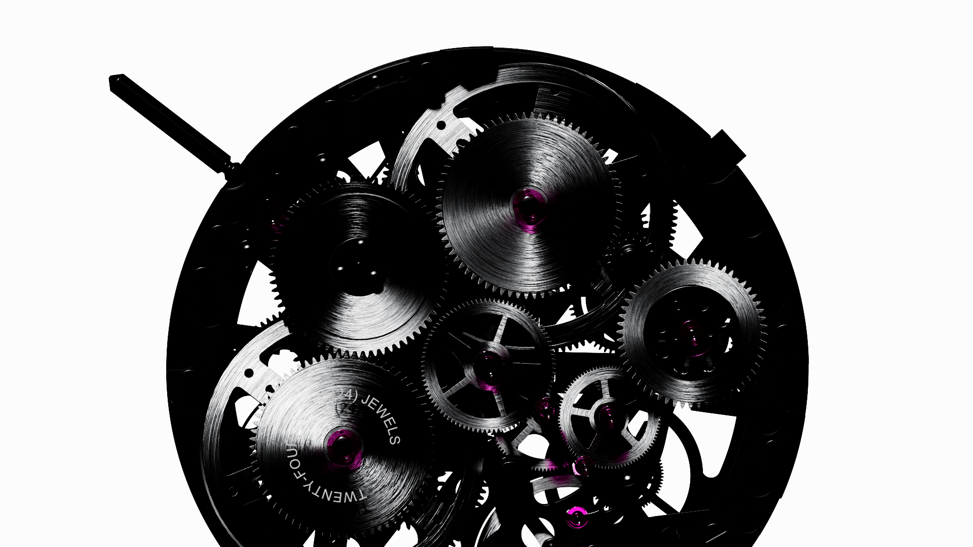
This bold product showcase, developed in 2022, is a slick collection of beauty shots – enhancing the design features of the watch, as well as the different components and the movement – captured with a graphic, succinct, and almost editorial approach.
 Styleframes
The idea behind the video is simple: since the beginning of the production, we aimed to elevate the beauty of each and every part of the watch, treating it as a stand-alone piece of design.
Metal structures, racks and grids are the ideal setting for the watch to shine, conveying the profoundly industrial feel of the product.
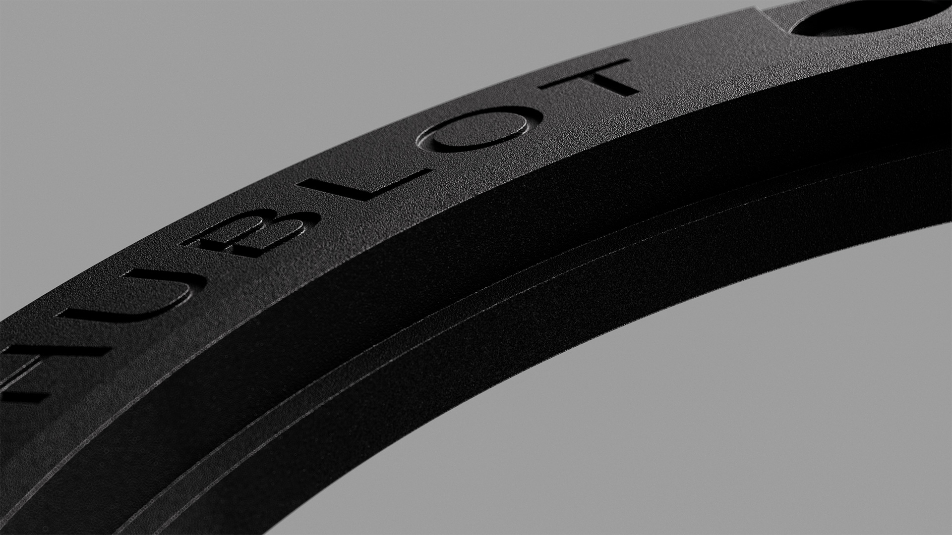
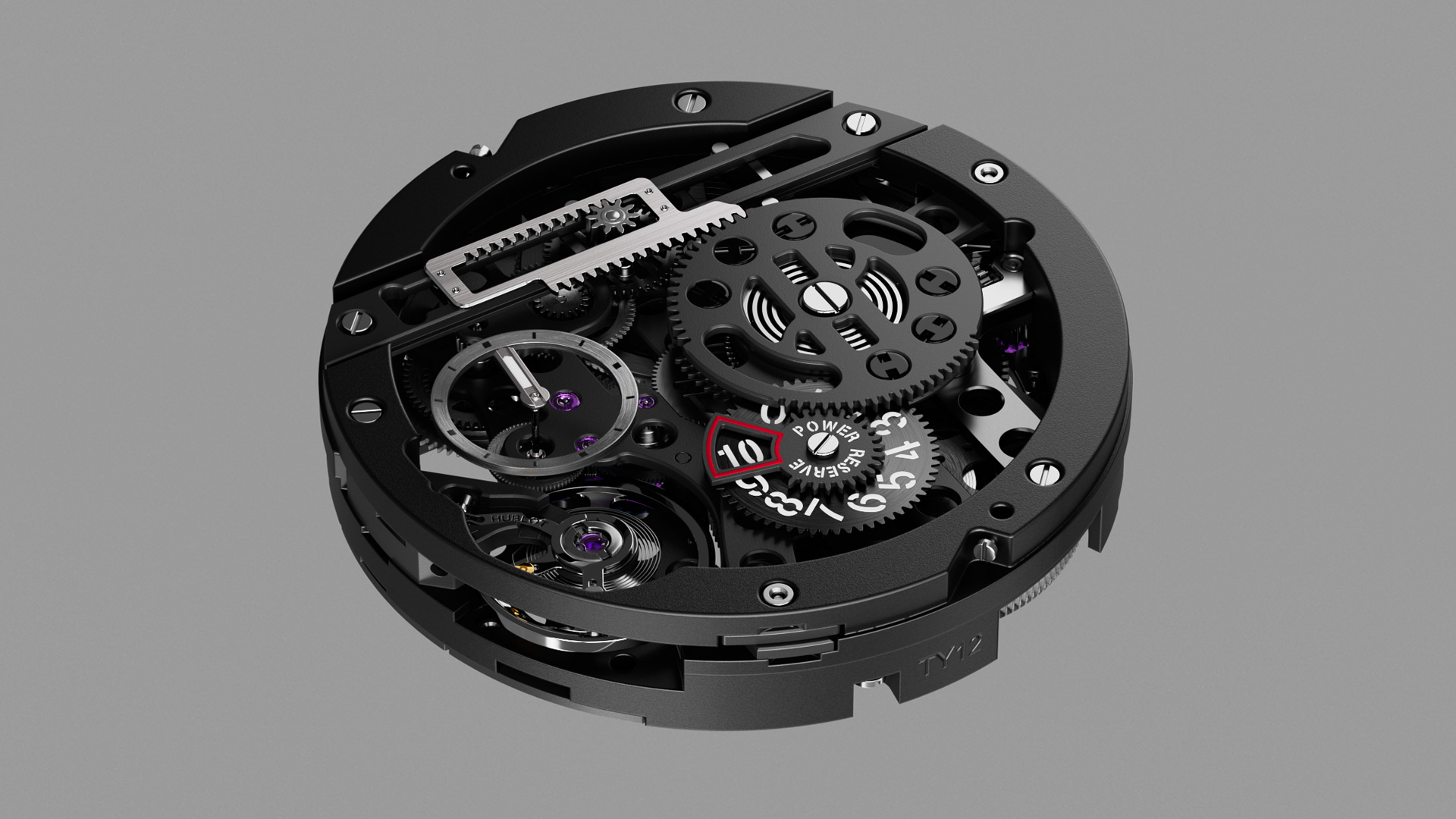
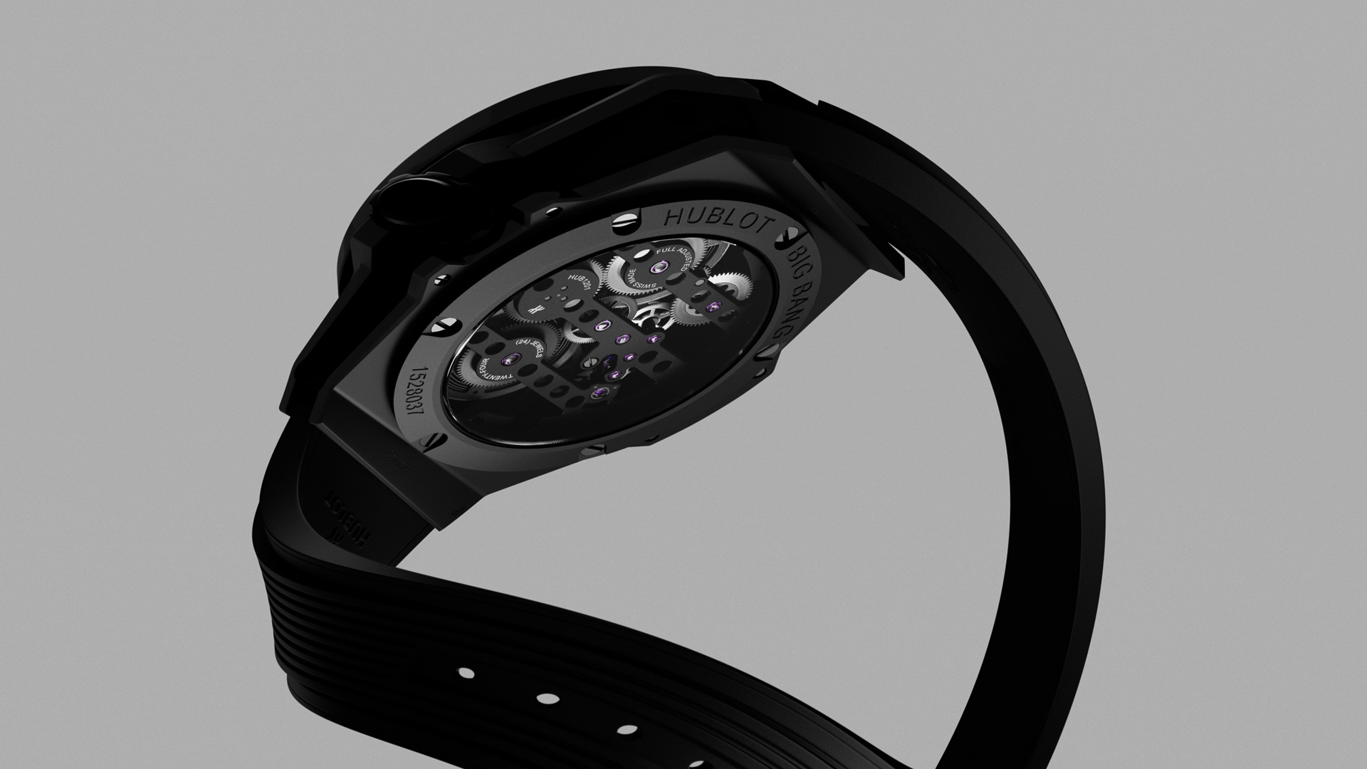

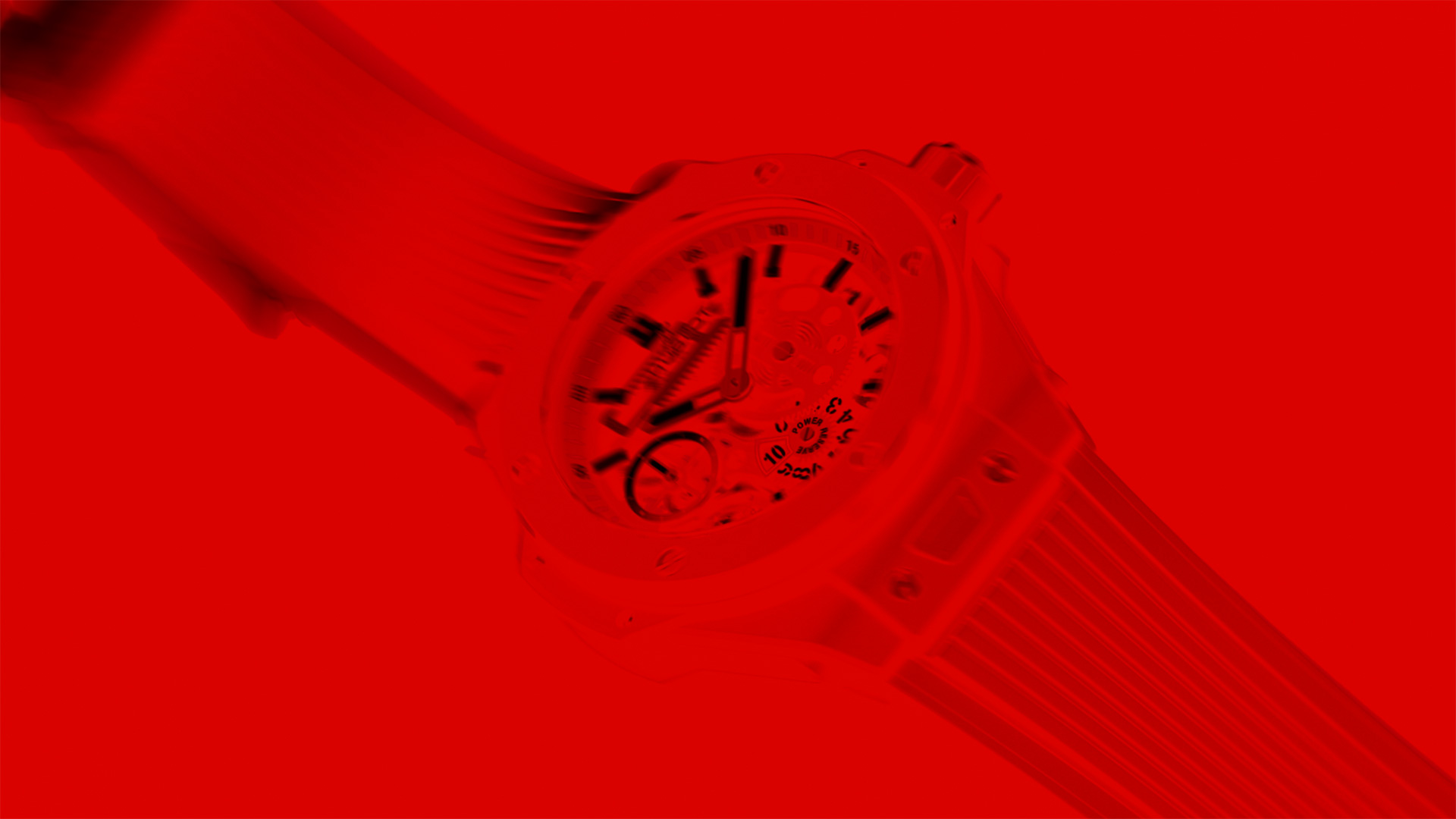
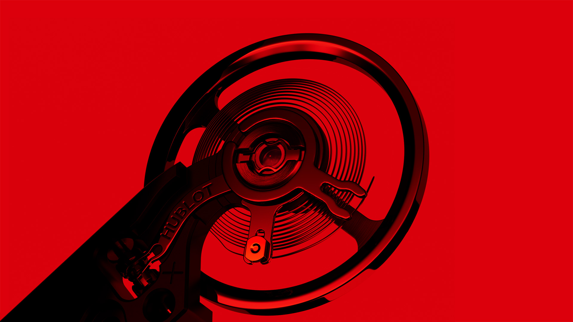
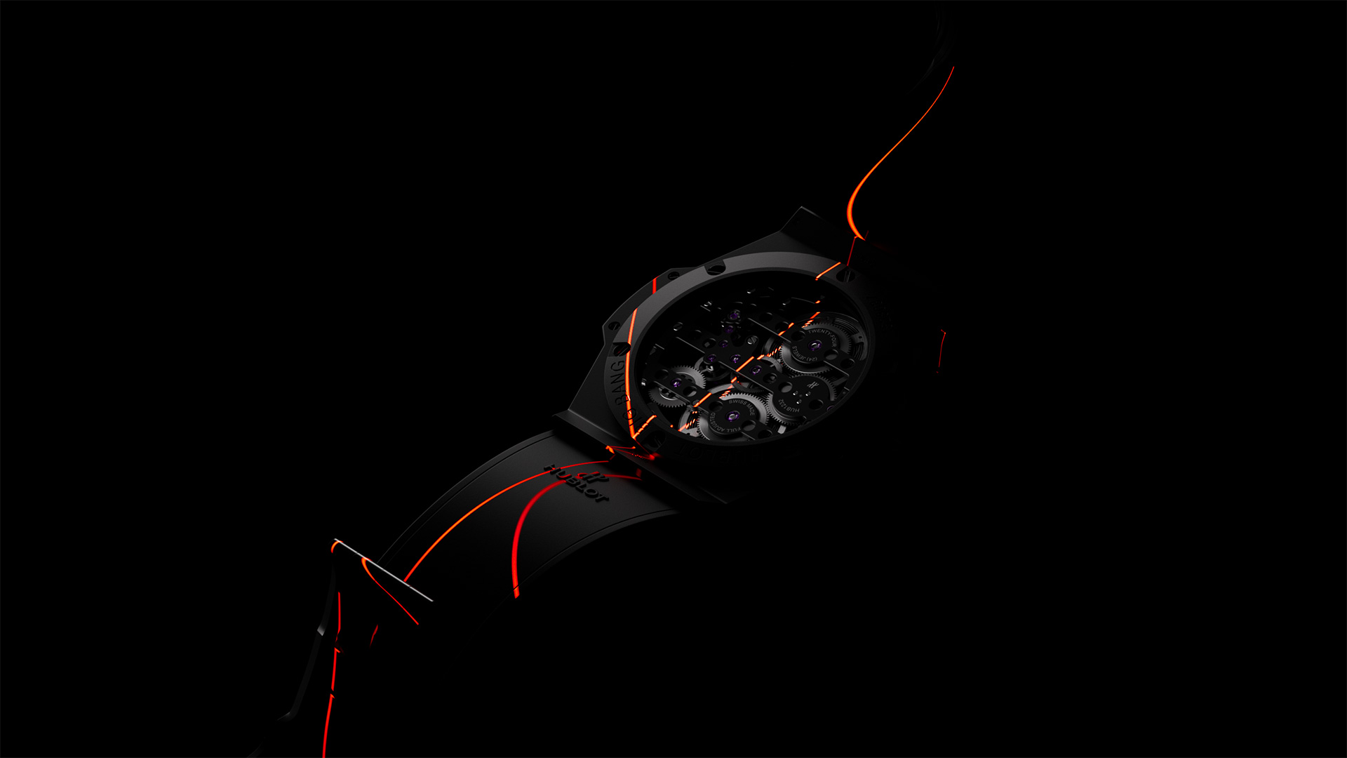
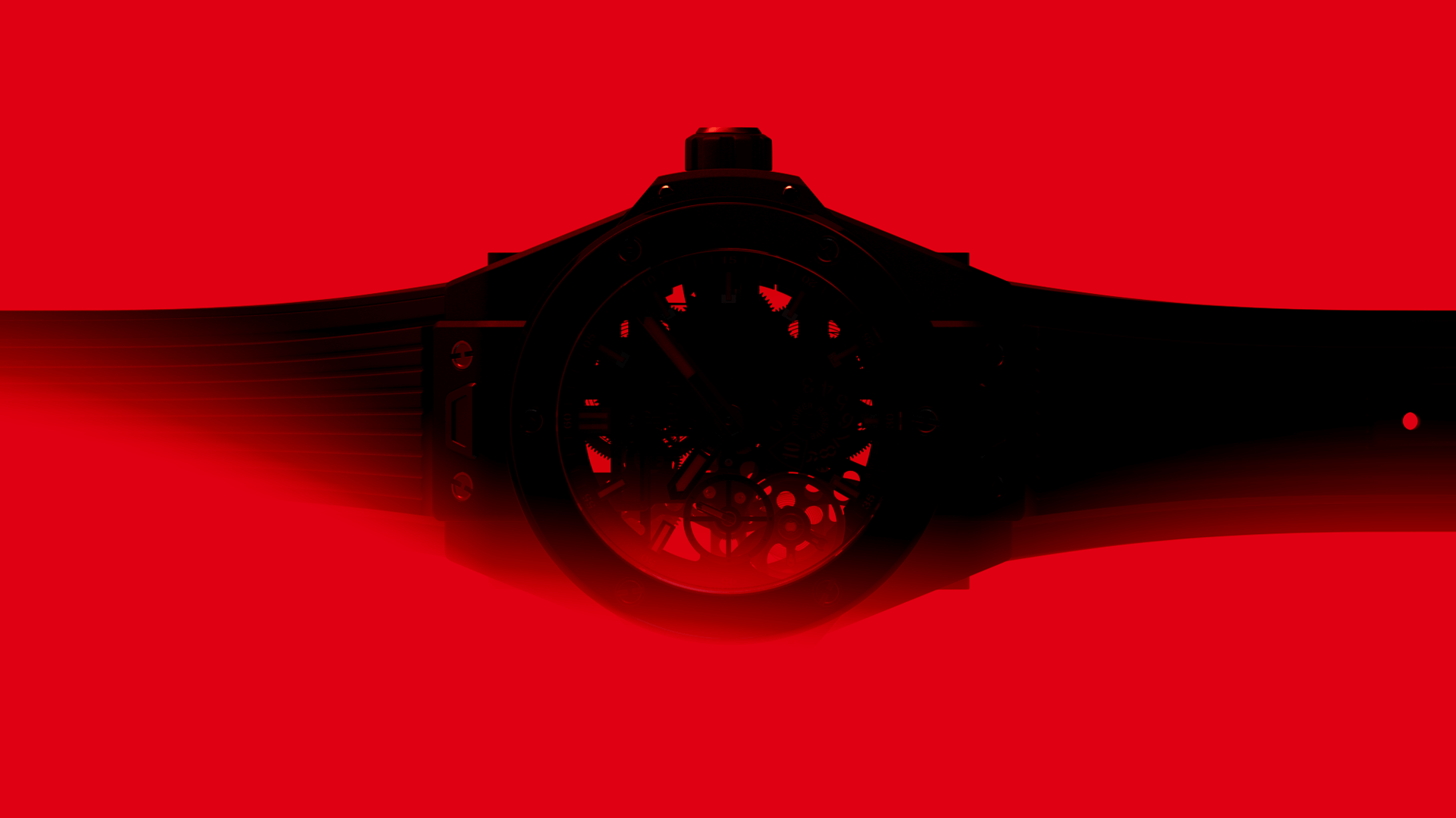
The red details on the dial and the case are just a hint for this color to become an iconic element throughout the whole film: the product arises from a flat red universe, it is enriched by pure red reflections and eventually scanned by red lasers.
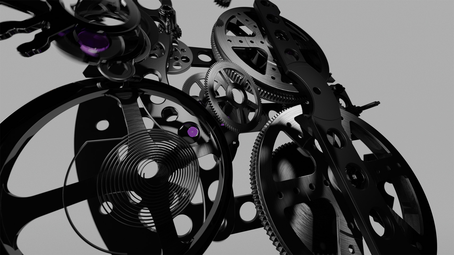
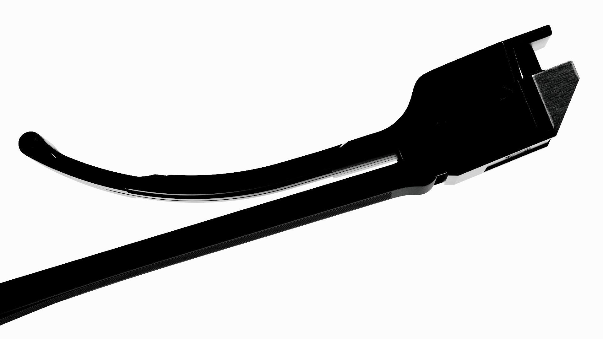
This hue is very powerful, and allows for extremely immersive and evocative visuals, especially in synergy with the use of photographic negative treatment on various shots. The black shadows on the product are intentionally handled as flat solid areas, providing an even more illustrative vibe in contrast with the hyper-detailed realism of the watch components highlighted.
Just make it big, red, and bold.


A consistent soundtrack and sound design are equally important to convey the concepts behind the video. We thought a mix of techno-industrial sounds would have perfectly connected with the most intimate nature of the product.

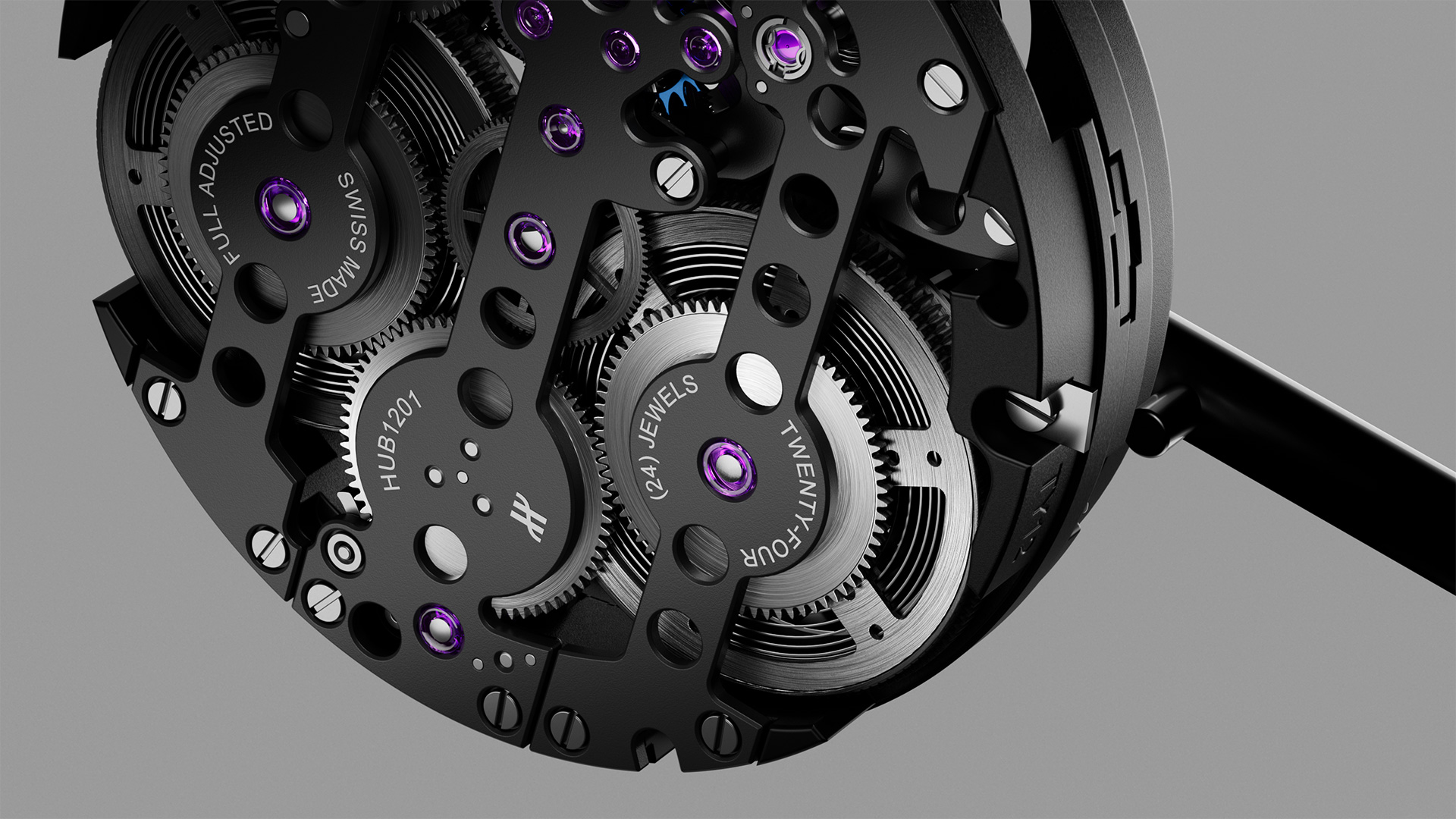
Electronic music utterly resonates with the industrial yet elegant mood of the entire commercial.

 Development
One of the main goals during the research and development stage was the will to achieve a distinctively editorial feel, taking the most out of the use of flat shapes and silhouettes, both leveraging the watch as a whole and some of its iconic components.
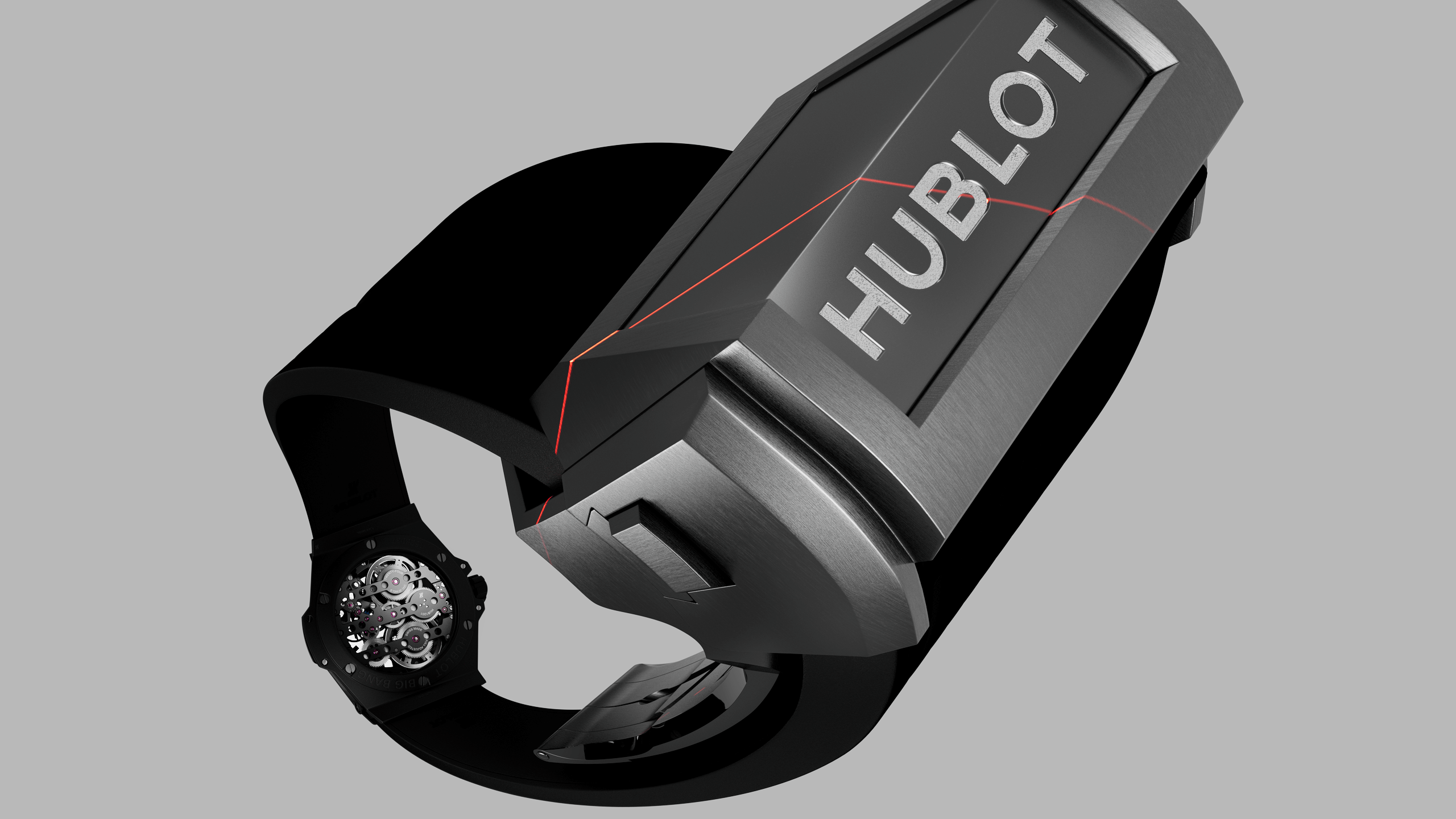
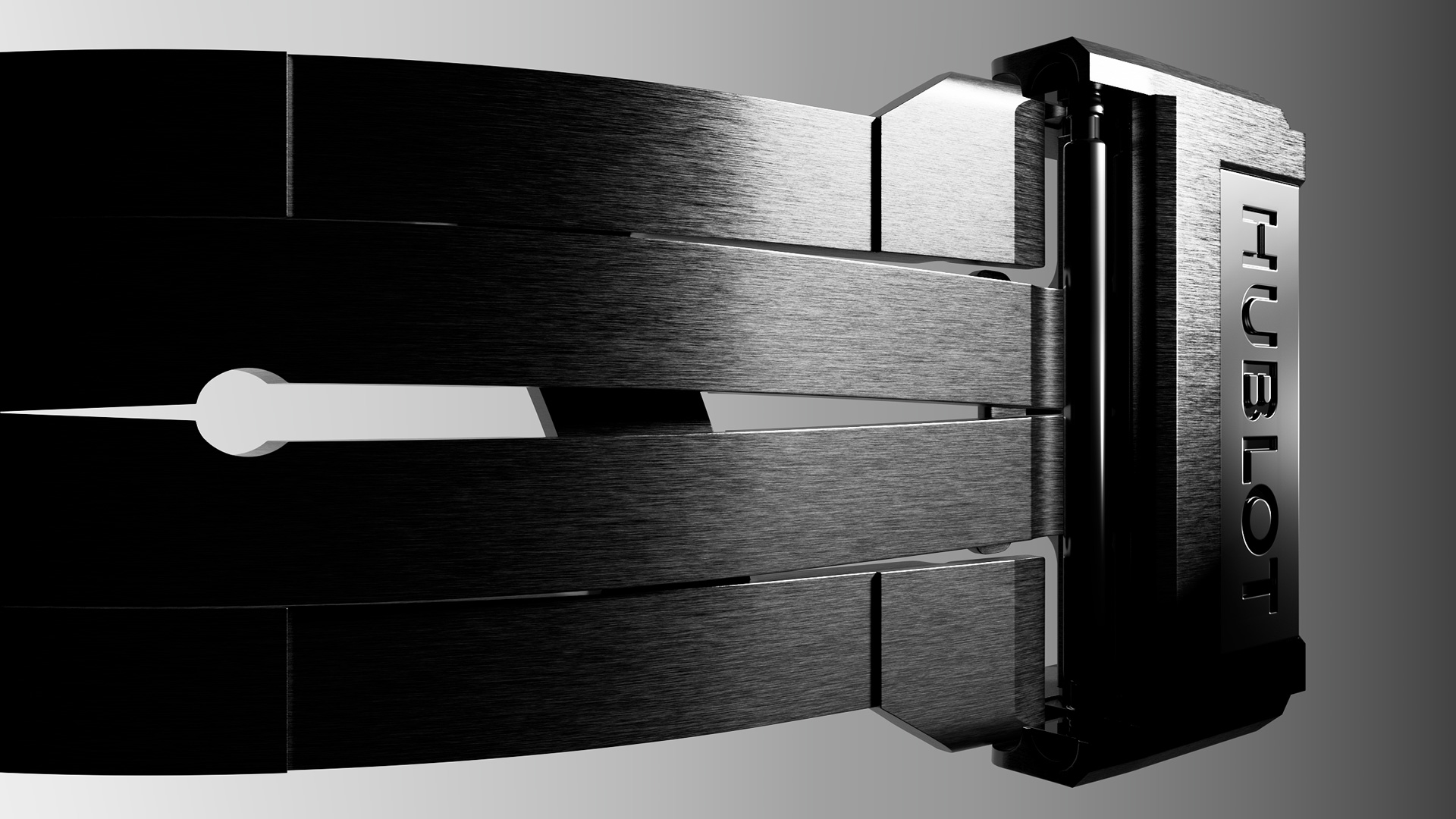
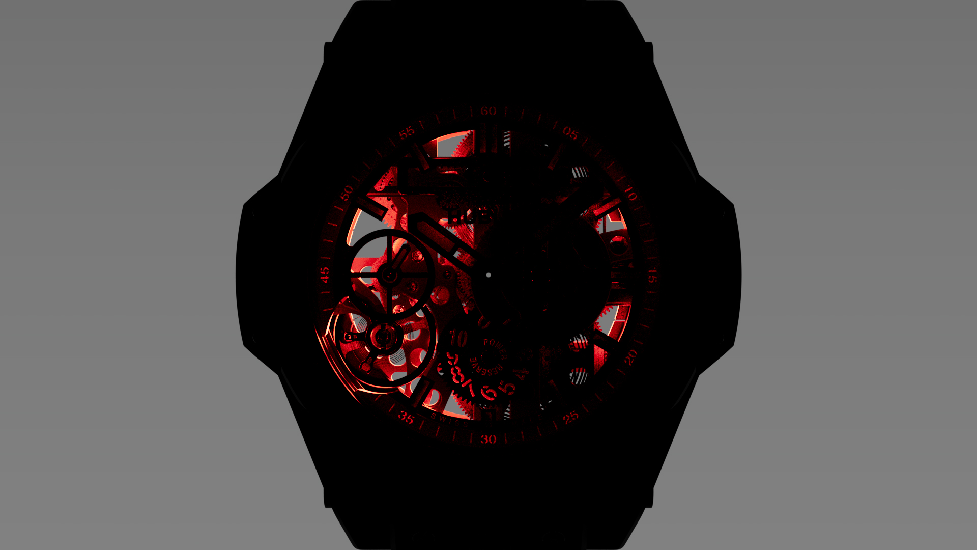
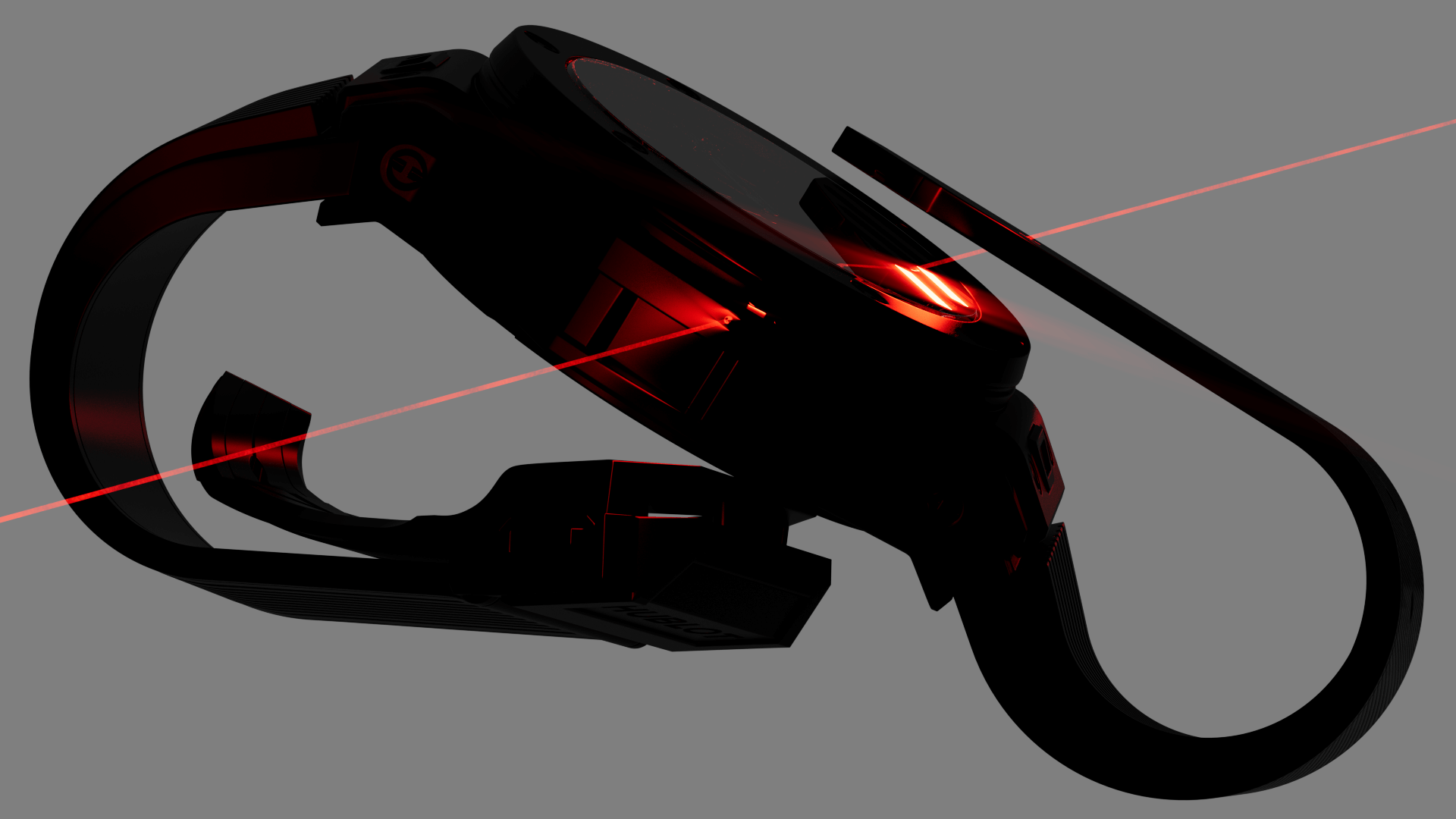
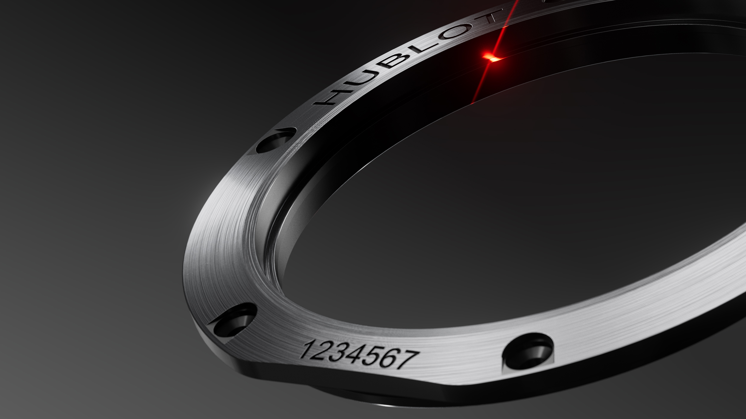
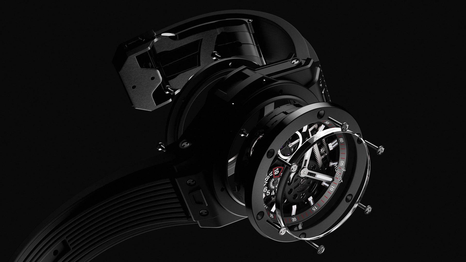
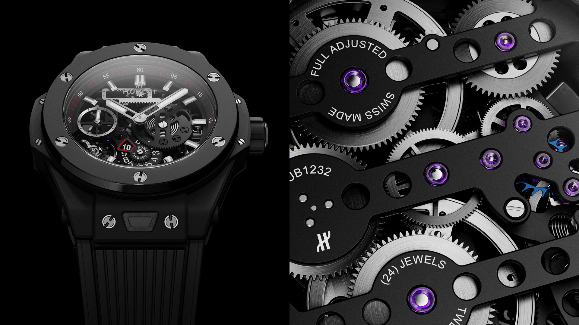
This was the stylistic trick: fresh flat backgrounds, graded in only 3 colors – black, grey, and red – in dialogue with 3D subjects rendered with a 2D intention.
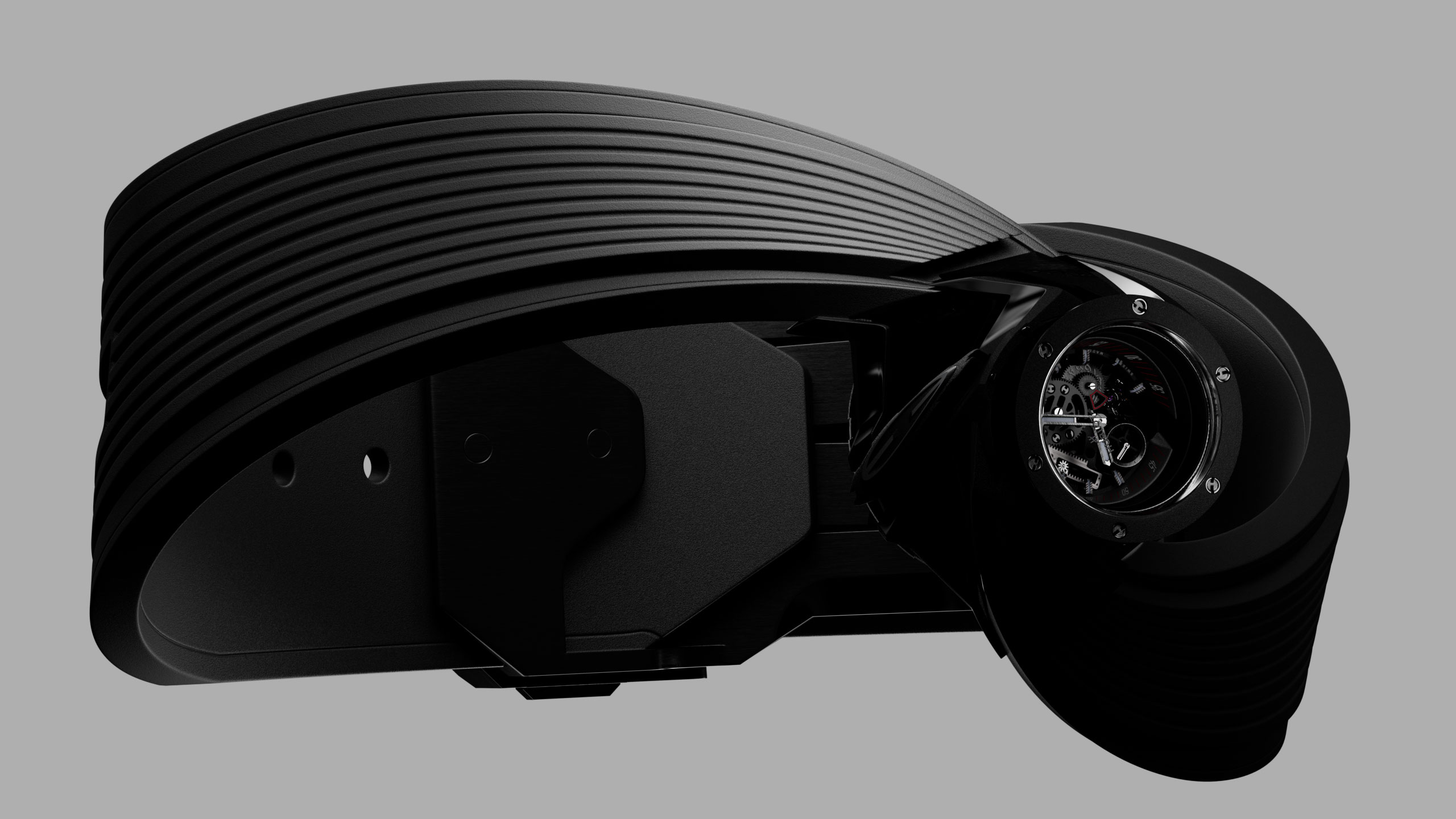
We thought a bi-dimensional illustrative spirit was the key to draw differences.

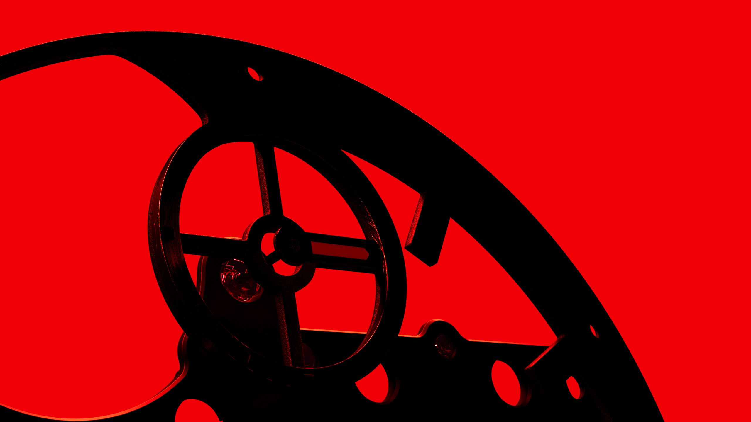


Another relevant role within the RnD phase was played by the endless development of industrial structures, which had to be used as setting for the product.
We explored a wide set of design options, ranging from the more art directed environments – featuring grids, metal panels, containers, pillars, wires and neon lights – to the more minimalistic holed plates.

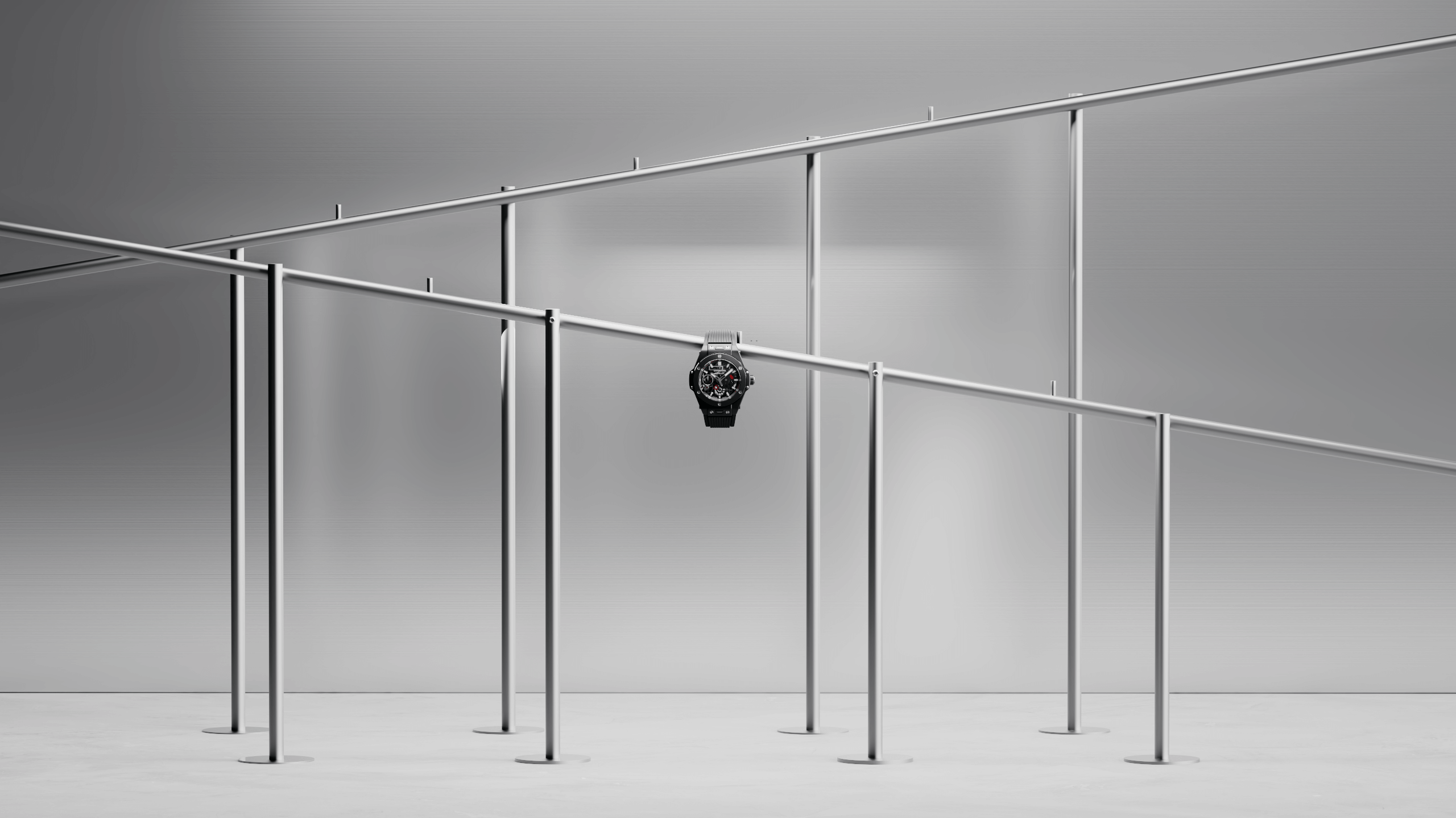
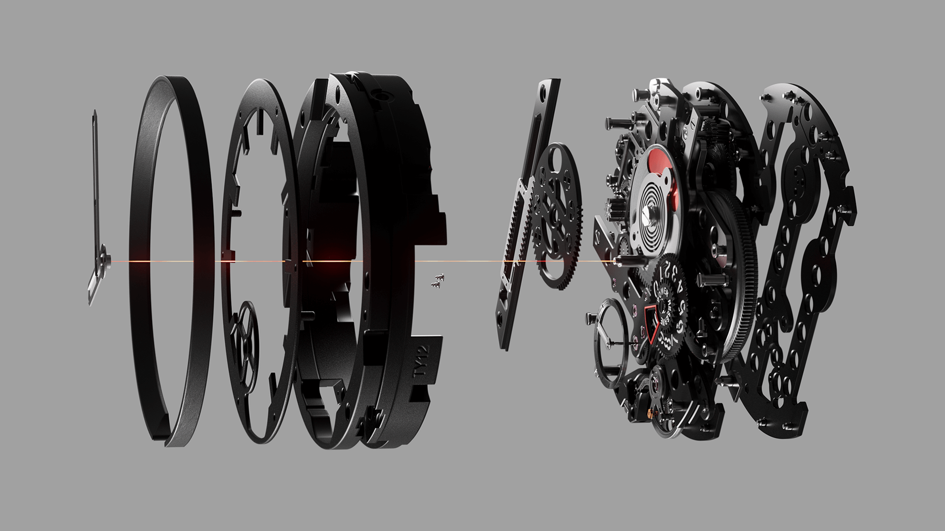
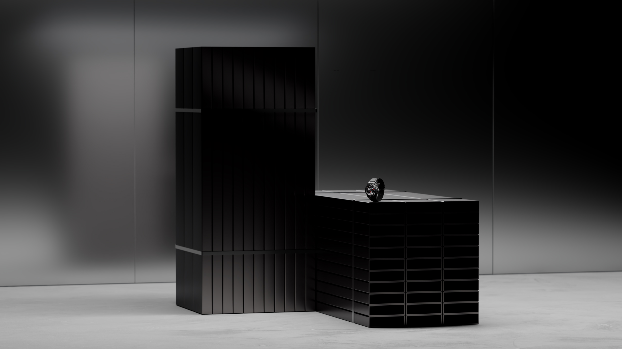
Pointless to mention that, eventually, simplicity always wins. Only the cleanest and less complex elements survived the client’s feedback and made it to the final edit.
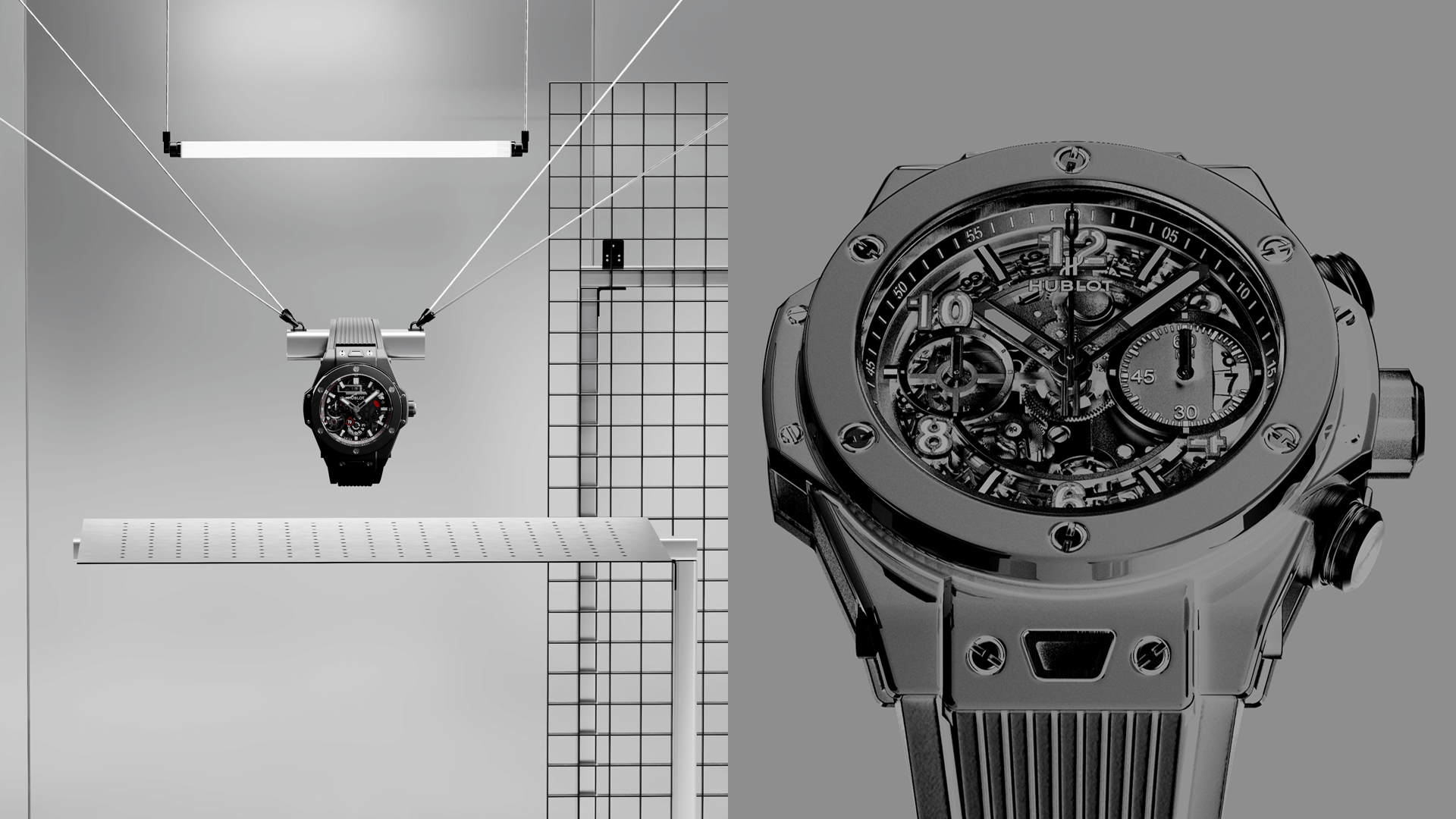
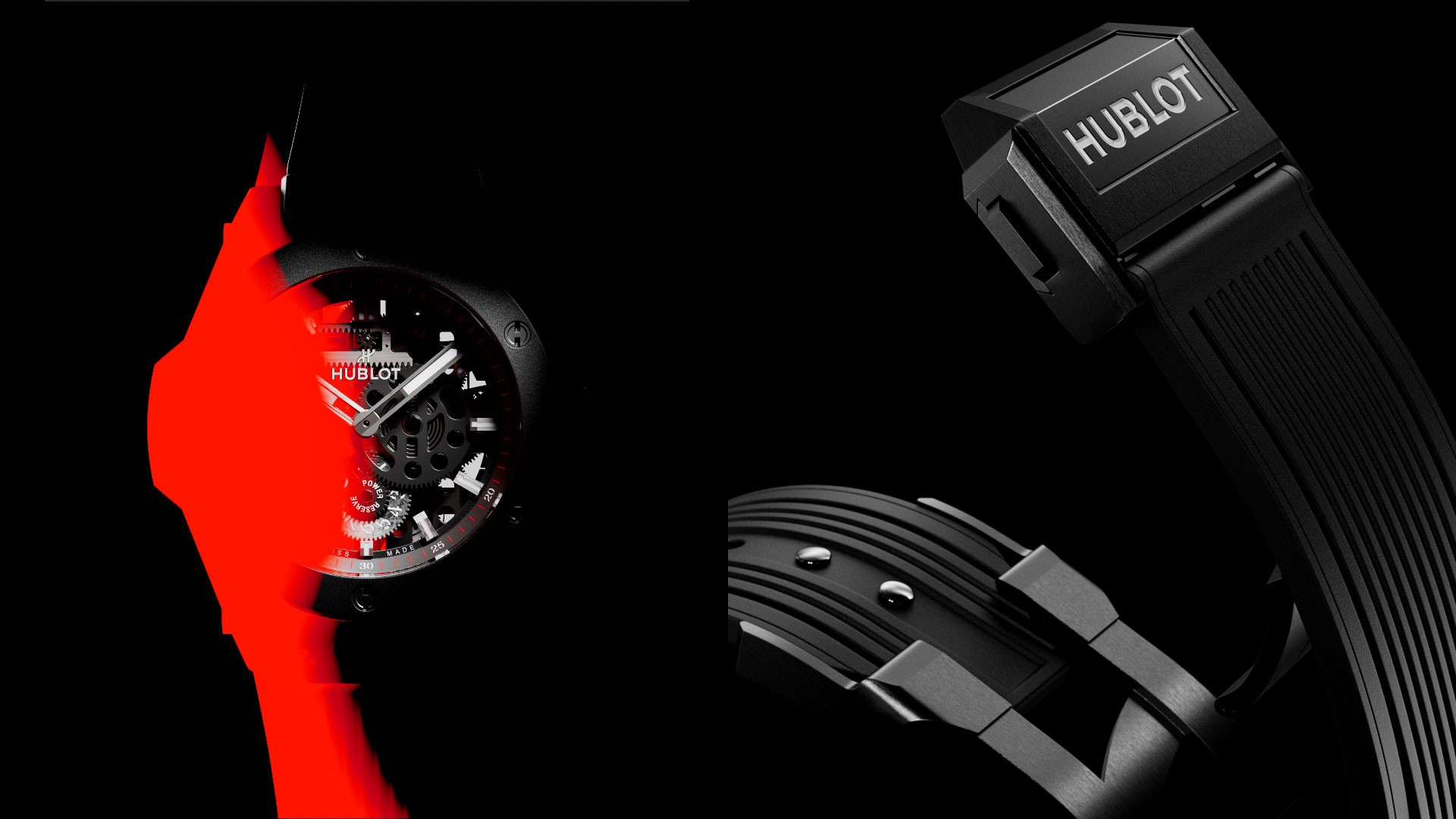
Minimal doesn’t mean trivial. In the end what really matters is intention: style is king.
